40% smoother game flow in Apollo MedGames after UX redesign
40% smoother game flow in Apollo MedGames after UX redesign
40% smoother game flow in Apollo MedGames after UX redesign
Apollo MedGames is an interactive mobile app that combines medical education with gaming mechanics. Its goal is to make health topics engaging, understandable, and accessible to users of all ages — from students to corporate teams .
Apollo MedGames is an interactive mobile app that combines medical education with gaming mechanics. Its goal is to make health topics engaging, understandable, and accessible to users of all ages — from students to corporate teams .

The Challenge
The Challenge
Can learning about health be fun?
Can learning about health be fun?
Can learning about health be fun?
How might we simplify and gamify the way people learn about health, so that individuals, families, and organizations can enjoy discovering medical knowledge — while building confidence in their ability to make healthier decisions?
Our challenge was to turn learning into a game — engaging users through emotion, competition, and curiosity for self-development.
How might we simplify and gamify the way people learn about health, so that individuals, families, and organizations can enjoy discovering medical knowledge — while building confidence in their ability to make healthier decisions?
Our challenge was to turn learning into a game — engaging users through emotion, competition, and curiosity for self-development.
The Solution
The Solution
Combination of verified health content and engaging gameplay
Combination of verified health content and engaging gameplay
Combination of verified health content and engaging gameplay
Users can:
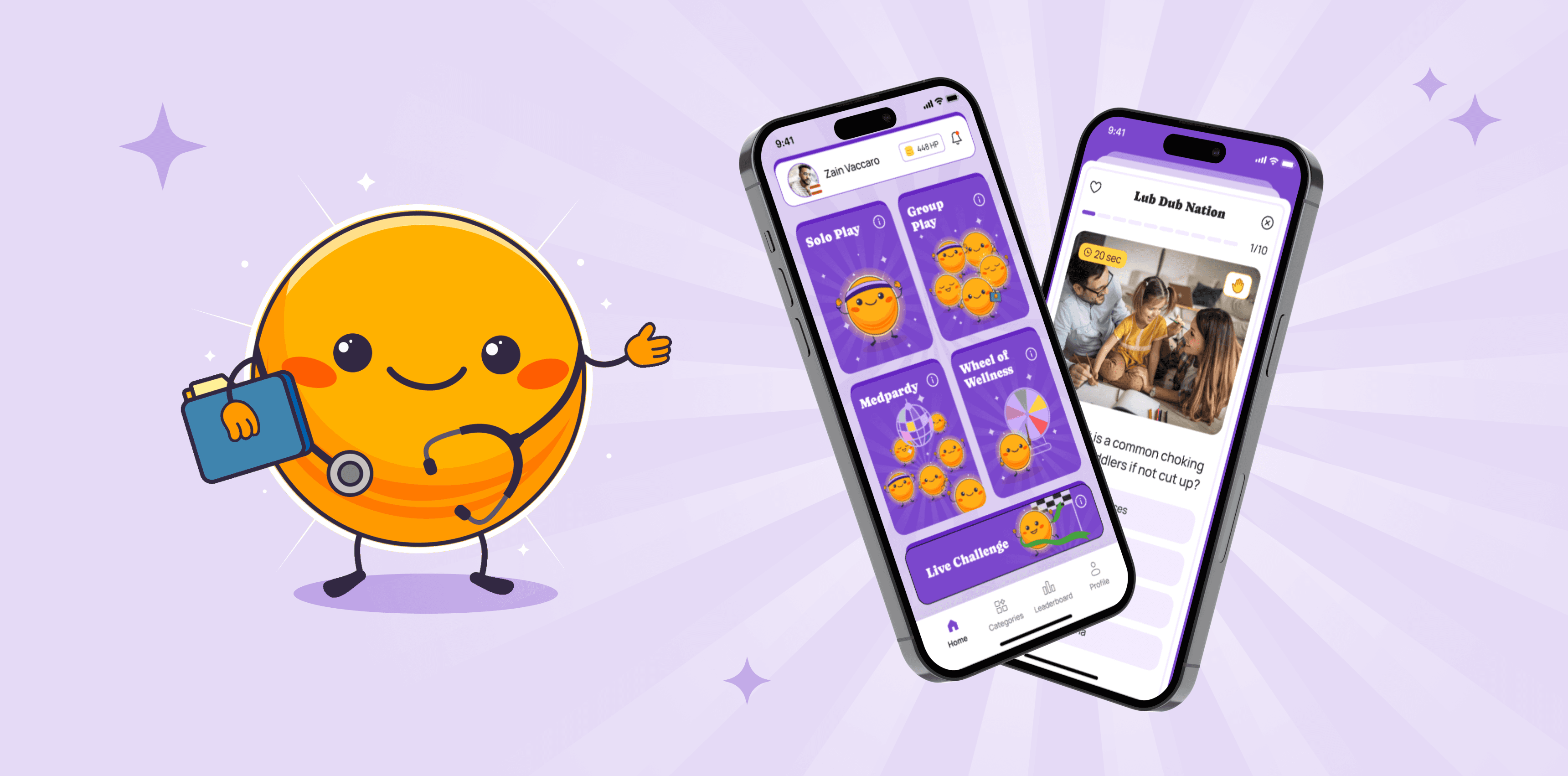
We created Apollo MedGames — a cross-platform mobile app with gamified medical quizzes that make learning about health exciting and accessible. The app combines verified medical knowledge with an engaging game flow — turning health education into an interactive, social experience.
Users can:
play in solo or group modes, or join unique experiences like MedParty, Wheel of Wellness, and Live Challenges;
play in solo or group modes, or join unique experiences like MedParty, Wheel of Wellness, and Live Challenges;
complete daily challenges and track their results in the leaderboard;
complete daily challenges and track their results in the leaderboard;
explore personal profiles that showcase progress and achievements;
explore personal profiles that showcase progress and achievements;
and unlock extra content through a premium subscription.
and unlock extra content through a premium subscription.

Project Goal
Project Goal
A cardiologist’s idea to teach medicine through play sparked the creation of Apollo MedGames
A cardiologist’s idea to teach medicine through play sparked the creation of Apollo MedGames
A cardiologist’s idea to teach medicine through play sparked the creation of Apollo MedGames
The idea for this app came from a cardiologist who wanted to create an educational tool to teach people essential medical knowledge. He had an initial screen structure.
Our design team focused on creating an intuitive and emotionally engaging interface.
We analyzed the pain points of different user groups — from parents to educational institutions — and identified a shared need: learning through play.
The idea for this app came from a cardiologist who wanted to create an educational tool to teach people essential medical knowledge. He had an initial screen structure.
Our design team focused on creating an intuitive and emotionally engaging interface.
We analyzed the pain points of different user groups — from parents to educational institutions — and identified a shared need: learning through play.
UX/UI Audit
UX/UI Audit
Pinpointing UX/UI weaknesses that shaped the redesign strategy
Pinpointing UX/UI weaknesses that shaped the redesign strategy
Pinpointing UX/UI weaknesses that shaped the redesign strategy
The first step in working on Apollo MedGames was conducting an audit of the current interface to identify weaknesses in the user experience and visual language of the app.
I analyzed screen structure, interaction flows, and visual patterns to understand what needed improvement.
The first step in working on Apollo MedGames was conducting an audit of the current interface to identify weaknesses in the user experience and visual language of the app.
I analyzed screen structure, interaction flows, and visual patterns to understand what needed improvement.

UX Findings (User Experience Issues)
UX Findings (User Experience Issues)
Lack of user control
Lack of user control
The app doesn’t allow users to skip registration or onboarding, and during gameplay there’s no way to exit or go back. This creates a feeling of being “stuck” in the process.
The app doesn’t allow users to skip registration or onboarding, and during gameplay there’s no way to exit or go back. This creates a feeling of being “stuck” in the process.
Inconsistent navigation
Inconsistent navigation
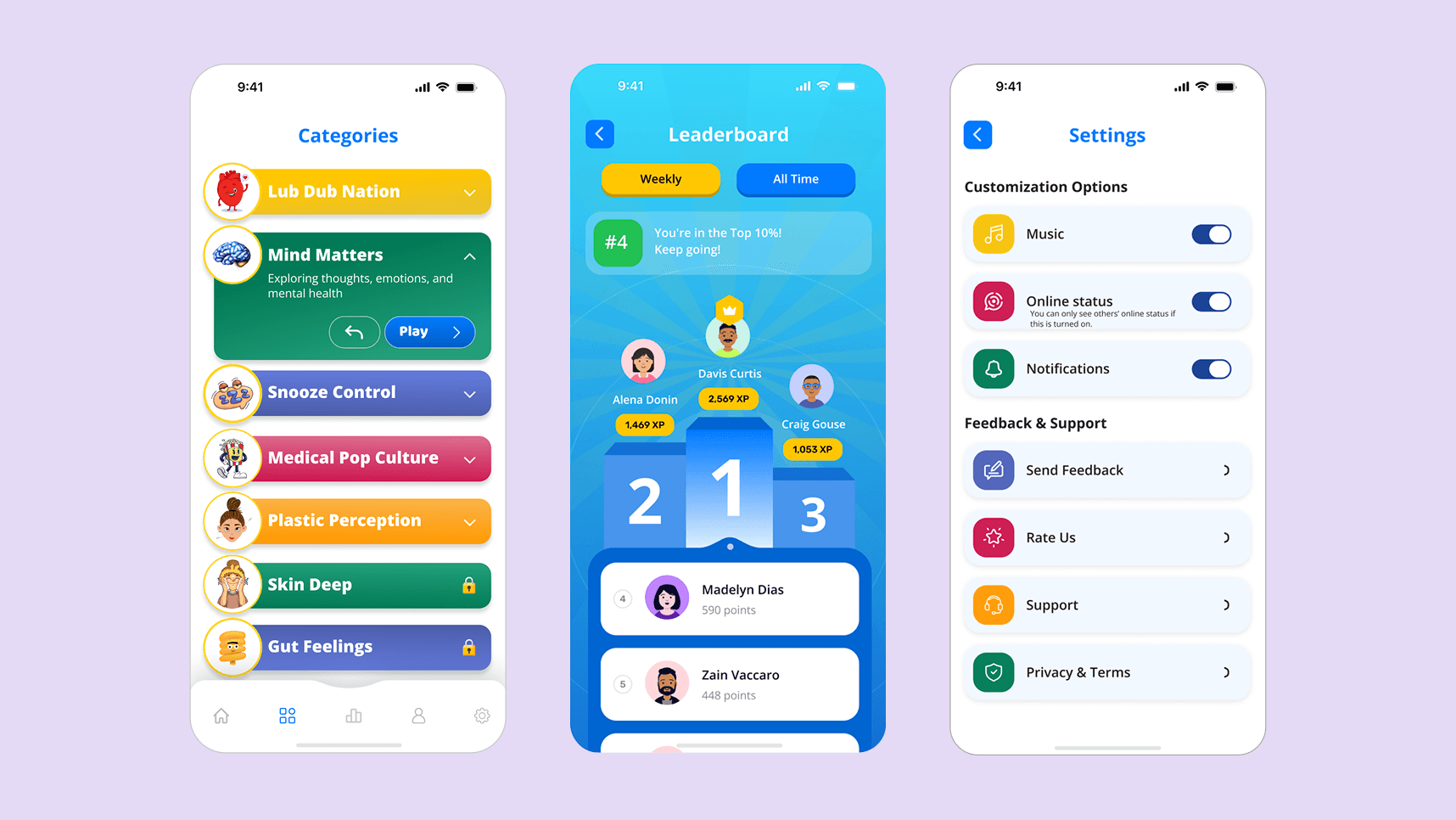
There is no main screen, and the tab bar appears only on certain pages, making it difficult to understand the overall flow of the app.
There is no main screen, and the tab bar appears only on certain pages, making it difficult to understand the overall flow of the app.
Unintuitive flow
Unintuitive flow
Screen sequences often lacked logic, forcing users to repeat actions or take unnecessary steps before starting a game. For example, to begin playing, users had to choose a category twice — first in the list, then again in the settings.
Screen sequences often lacked logic, forcing users to repeat actions or take unnecessary steps before starting a game. For example, to begin playing, users had to choose a category twice — first in the list, then again in the settings.
UI Findings (User Interface Issues)
UI Findings (User Interface Issues)
Lack of visual consistency
Lack of visual consistency
Buttons, icons, and shadows varied in shape, style, and emphasis, resulting in a non-systematic interface.
Buttons, icons, and shadows varied in shape, style, and emphasis, resulting in a non-systematic interface.
Readability problems
Readability problems
White text on blue (#299AE3) and pink-red (#BC3051) on blue had low contrast, and the 10px text in pop-ups was too small for comfortable reading.
White text on blue (#299AE3) and pink-red (#BC3051) on blue had low contrast, and the 10px text in pop-ups was too small for comfortable reading.
Inconsistent layout
Inconsistent layout
Spacing and alignment differed between screens, making the app appear uneven and cluttered.
Spacing and alignment differed between screens, making the app appear uneven and cluttered.
Text overload on informational screens
Text overload on informational screens
Onboarding and hints contained too much text instead of short, visually supported messages.
Onboarding and hints contained too much text instead of short, visually supported messages.

Design Session
Design Session
Showcasing visual style, mascot, icons etc. to align on the app’s look and feel
Showcasing visual style, mascot, icons etc. to align on the app’s look and feel
Showcasing visual style, mascot, icons etc. to align on the app’s look and feel
The first step in working on Apollo MedGames was conducting an audit of the current interface to identify weaknesses in the user experience and visual language of the app.
I analyzed screen structure, interaction flows, and visual patterns to understand what needed improvement.
The first step in working on Apollo MedGames was conducting an audit of the current interface to identify weaknesses in the user experience and visual language of the app.
I analyzed screen structure, interaction flows, and visual patterns to understand what needed improvement.

Visual Concept
Visual Concept
Transforming design session outcomes into visual solutions - maskot, colors, typography etc.
Transforming design session outcomes into visual solutions - maskot, colors, typography etc.
Transforming design session outcomes into visual solutions - maskot, colors, typography etc.
Key Decisions
Key Decisions
Mascot
Mascot
It's a symbol of energy, knowledge, and healing, representing Apollo, the god of the sun and medical wisdom.
I generated this concept in Midjourney, and we later handed it off to an illustrator, who developed several animated versions.
A 3D, bright, friendly sun guiding users on main screens, quiz results, gameplay modes, and question screens.
It's a symbol of energy, knowledge, and healing, representing Apollo, the god of the sun and medical wisdom.
I generated this concept in Midjourney, and we later handed it off to an illustrator, who developed several animated versions.
A 3D, bright, friendly sun guiding users on main screens, quiz results, gameplay modes, and question screens.


Concept & Metaphor
Concept & Metaphor
The app is based on a tabletop card game: categories are decks of cards, and each quiz question is a card from the chosen deck.
Just like tabletop card games, Apollo MedGames combines playful ease with structured learning.
This creates a friendly environment where users feel in control, motivated, and entertained while gradually absorbing important health knowledge.
The app is based on a tabletop card game: categories are decks of cards, and each quiz question is a card from the chosen deck.
Just like tabletop card games, Apollo MedGames combines playful ease with structured learning.
This creates a friendly environment where users feel in control, motivated, and entertained while gradually absorbing important health knowledge.
Tone of Voice
Tone of Voice
The tone is shaped by the Everyman and Sage archetypes: human and relatable, yet thoughtful and trustworthy.
It balances friendliness with expertise, making users feel both supported and confident in the information they receive: “I’m with you” and “I know what I’m talking about.”
The tone is shaped by the Everyman and Sage archetypes: human and relatable, yet thoughtful and trustworthy.
It balances friendliness with expertise, making users feel both supported and confident in the information they receive: “I’m with you” and “I know what I’m talking about.”

Implementation
Implementation
Simplified interface reduced unnecessary interactions by 40%
Simplified interface reduced unnecessary interactions by 40%
Simplified interface reduced unnecessary interactions by 40%
During implementation, we created a complete set of mobile app screens, covering all user scenarios and interactive elements.
We measured the minimum number of steps required to start a game — in the previous version, users needed around 5 clicks, while in the redesigned flow this was reduced to 3, reflecting a 40% improvement in efficiency and flow clarity.
During implementation, we created a complete set of mobile app screens, covering all user scenarios and interactive elements.
We measured the minimum number of steps required to start a game — in the previous version, users needed around 5 clicks, while in the redesigned flow this was reduced to 3, reflecting a 40% improvement in efficiency and flow clarity.

Reflections
Reflections
Key takeaways from the design journey
Key takeaways from the design journey
Key takeaways from the design journey
This project taught me that education can be genuinely fun when delivered through play, emotion, and empathy.
This project taught me that education can be genuinely fun when delivered through play, emotion, and empathy.
The true strength of Apollo MedGames’ design lies in its ability to make the complex simple and the useful exciting.
The true strength of Apollo MedGames’ design lies in its ability to make the complex simple and the useful exciting.
Ultimately, the product doesn’t just inform — it builds a connection between knowledge and behavior, inspiring users to care for their health every day.
Ultimately, the product doesn’t just inform — it builds a connection between knowledge and behavior, inspiring users to care for their health every day.

Other projects
Other projects
Other projects

Designing Girls Talk to help women build meaningful friendships online and offline
Mobile App
Mobile App
Mobile App
Social
Social
Social
Lifestyle
Lifestyle
Lifestyle

