Redesigning Karazin university’s admissions site for 40% faster performance
Redesigning Karazin university’s admissions site for 40% faster performance
Redesigning Karazin university’s admissions site for 40% faster performance
Start Karazin is a website of Kharkiv National University named after V. N. Karazin, aimed at helping prospective students explore study programs, find all necessary admission information, and choose the right university.
Start Karazin is a website of Kharkiv National University named after V. N. Karazin, aimed at helping prospective students explore study programs, find all necessary admission information, and choose the right university.

Role
Role
UI/UX Designer
UI/UX Designer
UI/UX Designer
Industry
Industry
Education
Education
Duration
Duration
2 months
2 months
2 months
The Challenge
The Challenge
Redesigning the university website to make studying paths clear and accessible
Redesigning the university website to make studying paths clear and accessible
Redesigning the university website to make studying paths clear and accessible
How might we redesign a website for prospective students that provides clear, structured, and easily accessible information about study programs and the admission process, while simplifying complex content, improving navigation, and balancing the university’s historic brand with modern design expectations?
How might we redesign a website for prospective students that provides clear, structured, and easily accessible information about study programs and the admission process, while simplifying complex content, improving navigation, and balancing the university’s historic brand with modern design expectations?
UX Audit
UX Audit
Why the Karazin Admission Website Needed a Redesign
Why the Karazin Admission Website Needed a Redesign
Why the Karazin Admission Website Needed a Redesign
The existing site faced several problems: a confusing three-level navigation menu, long academic texts, outdated visual design, lack of visual hierarchy, and no mobile adaptation. The goal was to redesign the site in a way that made it intuitive, visually appealing, and mobile-friendly, while also meeting the needs of the university administration and preserving the brand identity.
The existing site faced several problems: a confusing three-level navigation menu, long academic texts, outdated visual design, lack of visual hierarchy, and no mobile adaptation. The goal was to redesign the site in a way that made it intuitive, visually appealing, and mobile-friendly, while also meeting the needs of the university administration and preserving the brand identity.

UX Issues
UX Issues
Overcomplicated structure: Three-level navigation and too many clicks make it hard to reach key information.
Overcomplicated structure: Three-level navigation and too many clicks make it hard to reach key information.
Poor mobile experience: The site isn’t adapted for smartphones, leading to usability issues.
Poor mobile experience: The site isn’t adapted for smartphones, leading to usability issues.
Unclear user flow: Pages don’t guide users toward main actions and lack visible CTAs.
Unclear user flow: Pages don’t guide users toward main actions and lack visible CTAs.
Limited searchability: No filters or search for programs, making it difficult to find relevant options.
Limited searchability: No filters or search for programs, making it difficult to find relevant options.
Repetitive layouts: Identical templates for all content types create monotony and confusion.
Repetitive layouts: Identical templates for all content types create monotony and confusion.
UI Issues
UI Issues
Outdated visuals: The interface doesn’t match modern web design standards.
Outdated visuals: The interface doesn’t match modern web design standards.
Weak hierarchy: Low contrast, small typography, and unbalanced colors reduce readability and focus.
Weak hierarchy: Low contrast, small typography, and unbalanced colors reduce readability and focus.
Inconsistent elements: Icons, images, and layouts vary in style and proportion.
Inconsistent elements: Icons, images, and layouts vary in style and proportion.
Overloaded navigation: The top menu contains too many items without grouping.
Overloaded navigation: The top menu contains too many items without grouping.
Static presentation: Large text blocks and lack of interactivity make the site feel dull and dense.
Static presentation: Large text blocks and lack of interactivity make the site feel dull and dense.
The Solution
The Solution
Turning complexity into a clear, engaging experience
Turning complexity into a clear, engaging experience
Turning complexity into a clear, engaging experience
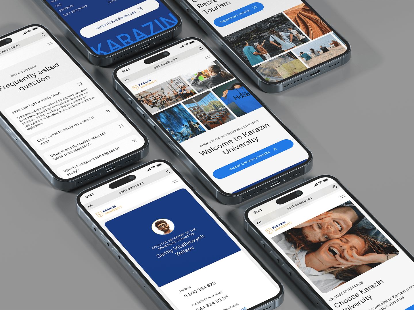
We completely restructured the website, simplifying navigation into a single logical line so that users can easily find information. Large blocks of academic text were broken into concise sections, with headings, tags, and accordion elements to improve readability and comprehension.
We completely restructured the website, simplifying navigation into a single logical line so that users can easily find information. Large blocks of academic text were broken into concise sections, with headings, tags, and accordion elements to improve readability and comprehension.

The design adopted a minimalist and modern approach, keeping the university’s brand colors while adding subtle contemporary accents for a fresh look. Interactive elements such as hover effects, flip cards, and animated text were introduced to make the site engaging without compromising performance or loading speed.
The design adopted a minimalist and modern approach, keeping the university’s brand colors while adding subtle contemporary accents for a fresh look. Interactive elements such as hover effects, flip cards, and animated text were introduced to make the site engaging without compromising performance or loading speed.
The admission programs page was transformed from dense tables into visual cards with filters and icons indicating the field of study.
The admission programs page was transformed from dense tables into visual cards with filters and icons indicating the field of study.

A redesigned “Admissions Calendar” was created with clear timelines and filters, helping students stay on track with application deadlines.
A redesigned “Admissions Calendar” was created with clear timelines and filters, helping students stay on track with application deadlines.

Outcome
Outcome
Page loading speed improved by 40%
Page loading speed improved by 40%
Page loading speed improved by 40%
The previous website had a complex structure with three levels of navigation, large unoptimized images, and long academic text blocks. Outdated page templates and excessive code created multiple server requests, resulting in an average loading time of around 5.5 seconds.
The previous website had a complex structure with three levels of navigation, large unoptimized images, and long academic text blocks. Outdated page templates and excessive code created multiple server requests, resulting in an average loading time of around 5.5 seconds.
The new architecture simplified page hierarchy and reduced redundant content. Images were optimized for web, heavy tables were replaced with lightweight card layouts, and unnecessary scripts were removed. The cleaner code and modular design improved technical performance across devices.
The new architecture simplified page hierarchy and reduced redundant content. Images were optimized for web, heavy tables were replaced with lightweight card layouts, and unnecessary scripts were removed. The cleaner code and modular design improved technical performance across devices.
Following these improvements, the average page loading time decreased to 3.3 seconds — a 40% increase in speed.
Following these improvements, the average page loading time decreased to 3.3 seconds — a 40% increase in speed.
Following these improvements, the average page loading time decreased to 3.3 seconds — a 40% increase in speed.

Reflections
Reflections
UX, сollaboration, and сommunication
UX, сollaboration, and сommunication
UX, сollaboration, and сommunication
Strengthened my ability to manage complex design systems while ensuring consistency across multiple page types and user flows.
Strengthened my ability to manage complex design systems while ensuring consistency across multiple page types and user flows.
Deepened my expertise in translating stakeholder requirements into accessible, data-informed UX decisions.
Deepened my expertise in translating stakeholder requirements into accessible, data-informed UX decisions.
Enhanced my strategic approach to balancing institutional identity with contemporary visual and interaction patterns.
Enhanced my strategic approach to balancing institutional identity with contemporary visual and interaction patterns.
Reinforced my focus on measurable outcomes — using performance metrics to validate design impact and efficiency.
Reinforced my focus on measurable outcomes — using performance metrics to validate design impact and efficiency.


