How we enhanced Kopilot.ID’s flow and made interactions 20% faster
How we enhanced Kopilot.ID’s flow and made interactions 20% faster
How we enhanced Kopilot.ID’s flow and made interactions 20% faster
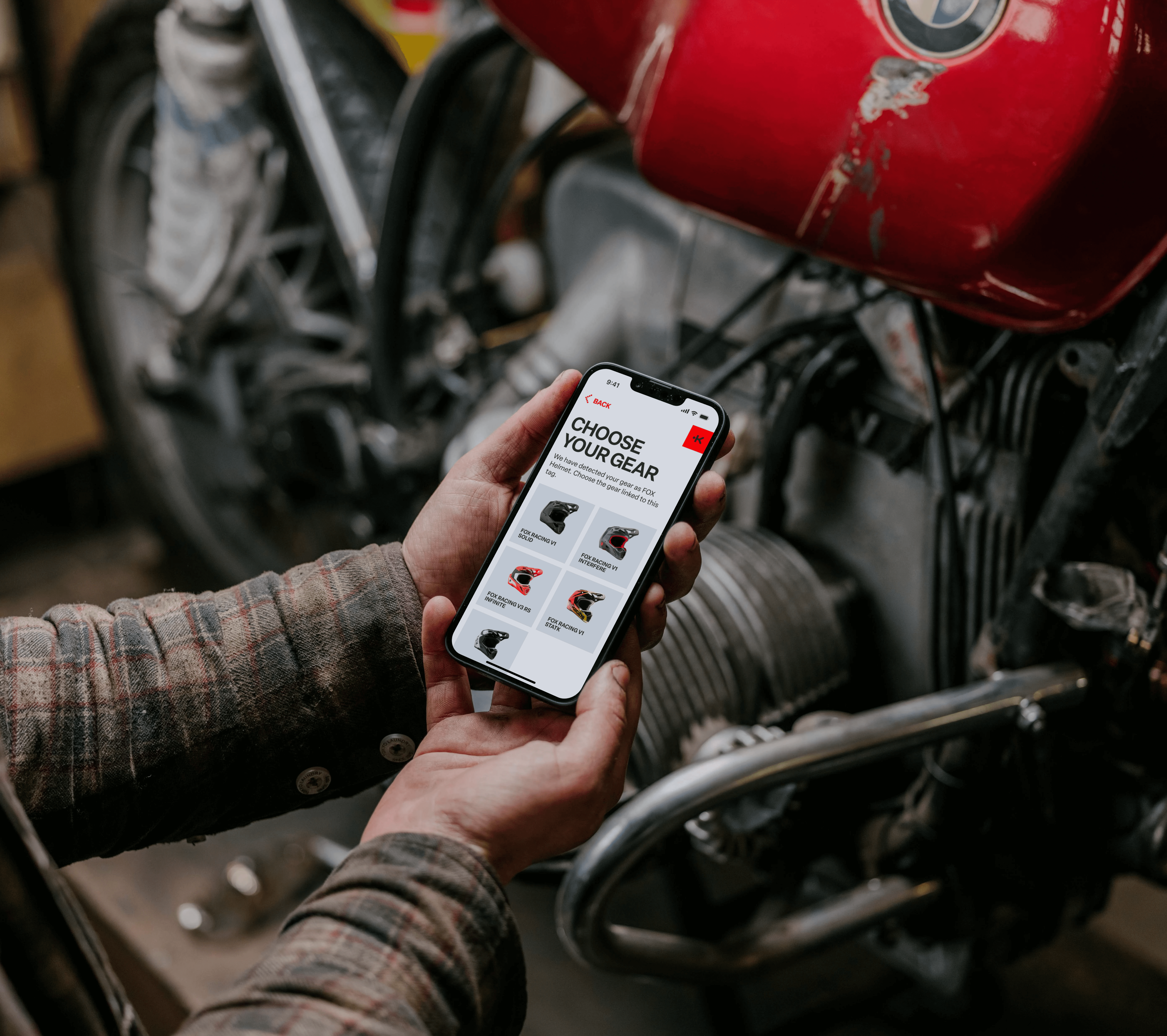
Kopilot ID is a digital health identification system for emergencies, built on NFC technology. The cross-platform mobile app pairs with NFC tags embedded in helmets and gear, allowing users to store critical medical information and emergency contacts that rescuers and medical professionals can access instantly during emergencies—even without network connectivity.
Kopilot ID is a digital health identification system for emergencies, built on NFC technology. The cross-platform mobile app pairs with NFC tags embedded in helmets and gear, allowing users to store critical medical information and emergency contacts that rescuers and medical professionals can access instantly during emergencies—even without network connectivity.
Kopilot ID is a digital health identification system for emergencies, built on NFC technology. The cross-platform mobile app pairs with NFC tags embedded in helmets and gear, allowing users to store critical medical information and emergency contacts that rescuers and medical professionals can access instantly during emergencies—even without network connectivity.
The Challenge
The Challenge
Designing a simple and reliable way to create and share Medical IDs in critical moments
Designing a simple and reliable way to create and share Medical IDs in critical moments
Designing a simple and reliable way to create and share Medical IDs in critical moments
How might we simplify the creation and management of a digital medical ID, so that athletes and adventure enthusiasts can feel protected, and medical teams can access essential data of a medical ID quickly during emergencies, even when the injured person cannot communicate their condition?
How might we simplify the creation and management of a digital medical ID, so that athletes and adventure enthusiasts can feel protected, and medical teams can access essential data of a medical ID quickly during emergencies, even when the injured person cannot communicate their condition?
The Solution
The Solution
Turning the client’s vision into a clear and user-friendly design
Turning the client’s vision into a clear and user-friendly design
Turning the client’s vision into a clear and user-friendly design
The client, both a developer and product owner, initially attempted to design the app himself, using his own vision for the user flow. For the visual part, he tried to follow the existing brand identity created by a previous design team. However, the resulting flow was too complex and not user-friendly.
The client, both a developer and product owner, initially attempted to design the app himself, using his own vision for the user flow. For the visual part, he tried to follow the existing brand identity created by a previous design team. However, the resulting flow was too complex and not user-friendly.
We implemented:
We implemented:
Design consistent with the existing brand identity and website, ensuring a cohesive and unified visual experience across platforms
Design consistent with the existing brand identity and website, ensuring a cohesive and unified visual experience across platforms
A clear and guided process for creating a new gear card using NFC scanning, making it easy for users to add their medical information and link it to their equipment
A clear and guided process for creating a new gear card using NFC scanning, making it easy for users to add their medical information and link it to their equipment
A more intuitive navigation system, improving the original flow provided by the client
A more intuitive navigation system, improving the original flow provided by the client

UX Audit
UX Audit
Identifying key issues and opportunities for app improvement
Identifying key issues and opportunities for app improvement
Identifying key issues and opportunities for app improvement
While the visual foundation was already established through the existing design system, my audit of the client’s self-developed version revealed multiple areas where design consistency and user experience could be significantly improved.
While the visual foundation was already established through the existing design system, my audit of the client’s self-developed version revealed multiple areas where design consistency and user experience could be significantly improved.

Key Problems
Key Problems
Problem 1: Visual Inconsistency
Problem 1: Visual Inconsistency
Inconsistent icons, shadows, border radii, and component usage weakened hierarchy and made the interface feel fragmented.
Inconsistent icons, shadows, border radii, and component usage weakened hierarchy and made the interface feel fragmented.
Problem 2: Unintuitive User Flow
Problem 2: Unintuitive User Flow
Creating a medical ID required too many unclear steps, which could frustrate users and cause drop-off.
Creating a medical ID required too many unclear steps, which could frustrate users and cause drop-off.
Problem 3: Poor Layout and Action Visibility
Problem 3: Poor Layout and Action Visibility
Key actions, like the primary task or “Add new gear,” were hard to spot or didn’t follow common mobile UI patterns.
Key actions, like the primary task or “Add new gear,” were hard to spot or didn’t follow common mobile UI patterns.
Problem 4: Inefficient Form Inputs
Problem 4: Inefficient Form Inputs
Free-text fields increased typing effort and errors; dropdowns or selection lists would streamline input.
Free-text fields increased typing effort and errors; dropdowns or selection lists would streamline input.
Problem 5: Lack of Guidance and Onboarding Cues
Problem 5: Lack of Guidance and Onboarding Cues
Minimal onboarding or contextual cues made it unclear what users should do next, reducing confidence and increasing friction.
Minimal onboarding or contextual cues made it unclear what users should do next, reducing confidence and increasing friction.
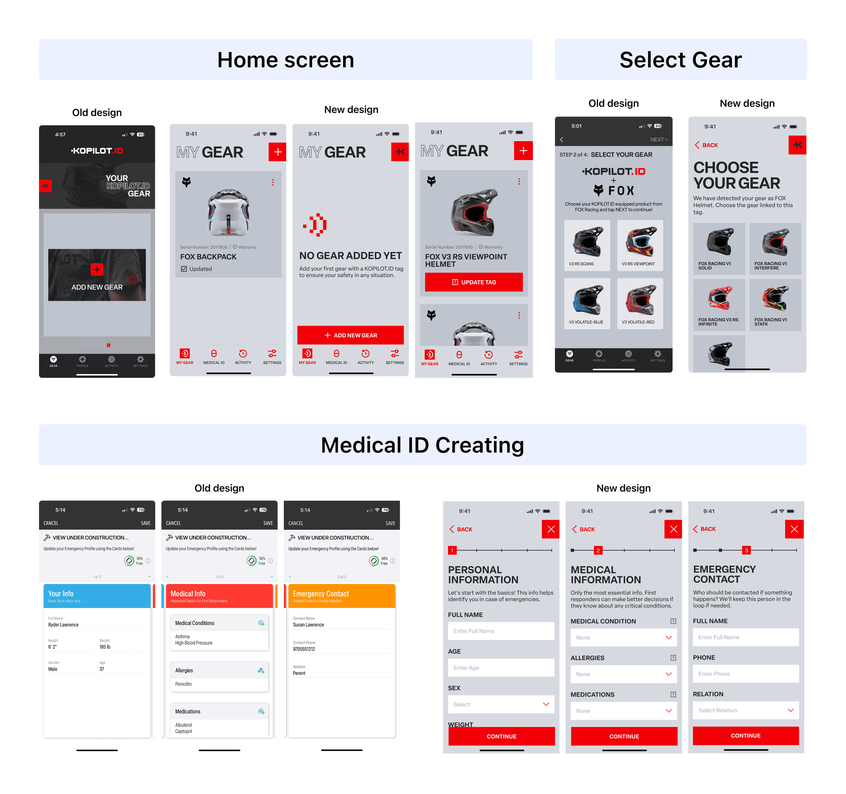
The screenshots show a comparison between the client’s original flow and the improved result, where the interface became clearer and more intuitive.
The screenshots show a comparison between the client’s original flow and the improved result, where the interface became clearer and more intuitive.
Visual Concept
Visual Concept
Adapting the website design system for a mobile experience
Adapting the website design system for a mobile experience
Adapting the website design system for a mobile experience
Based on the existing materials — specifically, the design system — my task was to develop a concept that would adapt the system, originally created for the website, to a mobile application.
Based on the existing materials — specifically, the design system — my task was to develop a concept that would adapt the system, originally created for the website, to a mobile application.

What challenged me
What challenged me
Improved user flow efficiency by 20% despite technical constraints
Improved user flow efficiency by 20% despite technical constraints
Improved user flow efficiency by 20% despite technical constraints
The original process of adding new gear was confusing: users had to scan the gear, enter medical information, and scan again to transfer data.
While a 40% reduction in steps was initially proposed by combining card creation and data transfer, technical constraints required keeping the two-scan process.
We still simplified the journey by 20% through several improvements:
autosave drafts for resuming later, a progress bar, automatic tag detection, clear primary action buttons, gear status indicators, dropdowns and pickers for faster data entry, and step-by-step visual instructions with animations and illustrations to make the process more intuitive.
We still simplified the journey by 20% through several improvements:
autosave drafts for resuming later, a progress bar, automatic tag detection, clear primary action buttons, gear status indicators, dropdowns and pickers for faster data entry, and step-by-step visual instructions with animations and illustrations to make the process more intuitive.
We still simplified the journey by 20% through several improvements: autosave drafts for resuming later, a progress bar, automatic tag detection, clear primary action buttons, gear status indicators, dropdowns and pickers for faster data entry, and step-by-step visual instructions with animations and illustrations to make the process more intuitive.
The Outcome
The Outcome
Delivered an intuitive medical ID flow that simplifies setup and enhances emergency safety
Delivered an intuitive medical ID flow that simplifies setup and enhances emergency safety
We designed an intuitive user flow for registering, creating, and updating a medical ID card, reducing friction for users while ensuring critical information can be reliably accessed via NFC tags in emergencies.
We designed an intuitive user flow for registering, creating, and updating a medical ID card, reducing friction for users while ensuring critical information can be reliably accessed via NFC tags in emergencies.

Reflections
Reflections
Key takeaways from the design journey
Key takeaways from the design journey
Working with an existing design system allowed me to focus on UX, adapting pre-made UI components to create a cohesive mobile experience.
Learned that an ideal user flow cannot always be implemented; it’s essential to balance user needs with business and technical constraints to create a solution that works for both.
Close collaboration with the client helped me understand the product, their vision, and business constraints.
Reinforced the importance of clarity and simplicity in UX for applications where usability can directly impact user safety.

Other projects
Other projects
Other projects

40% smoother game flow in Apollo MedGames after UX redesign
40% smoother game flow in Apollo MedGames after UX redesign
40% smoother game flow in Apollo MedGames after UX redesign
Mobile App
Mobile App
Mobile App
QuizApp
QuizApp
QuizApp
Education
Education
Education

